
Two coloring pages on the same holiday can feel completely different. Designers choose sizes, line weights, and subject detail in ways that shape focus, effort, and joy for a child. This guide shows how to assess pages before printing to support a positive experience.
Start with the child in mind: age, motor skills, interests, and the intended purpose should guide your choice before you evaluate the artwork. A page for a toddler benefits from broad shapes and thick outlines, while a page for an older child can reward careful line work and subtle shading. Clarify what the activity is for—calm, practice, or pure creativity—to pick a page that fits the moment. When you align the page with the learner's goals, the design matters less as a visual object and more as a tool for engagement. People often assume more detail is better, but for some kids a simple page reduces frustration and builds confidence quickly. Remember, you can adapt or pair a page with adjustable prompts to keep the experience productive and enjoyable.
Start With the Child, Not the Picture
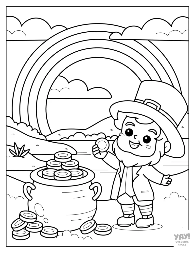
Consider the child's current tasks and environment. If a page is meant for quiet time at the end of a long day, you may favor simpler shapes that provide a sense of accomplishment quickly. If it's intended as a drawing warmup, you can welcome more exploratory spaces and opportunities to doodle. Asking the child what they want to color can also guide the choice; permission to choose fosters ownership. Remember that a well chosen page can support confidence and a positive attitude toward coloring.
Think about interests and accessibility. If the child loves shamrocks or animals, a page featuring those elements tends to hold attention longer. Offer small adjustments, like thicker lines or larger spaces, to accommodate varying abilities. When the child feels capable, they are more likely to engage with the task and enjoy the process. Finally, evaluate the page's purpose: is it practicing fine motor skills, expressing color choices, or simply relaxing? This practical lens helps you select pages that truly fit the moment.
Check the Level of Detail
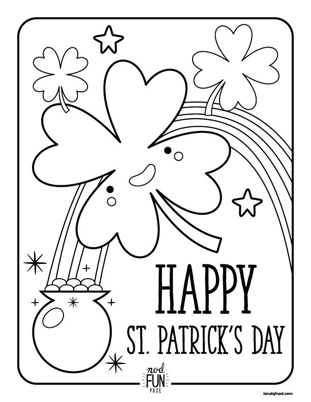
Detail level matters for matching a learner with the right challenge. Look for large, open spaces that allow quick completion for beginners and tighter, intricate sections for more experienced colorists. Consider line variety and how dense the image feels when printed at standard page sizes. A page with balanced density supports steady pencil control, while an overly busy composition can overwhelm a child and reduce enjoyment. Also assess whether the design offers a clear progression from simple to more complex areas, which helps pace the activity. If you can swap pages or adjust parts with markers, you can tailor the experience further.
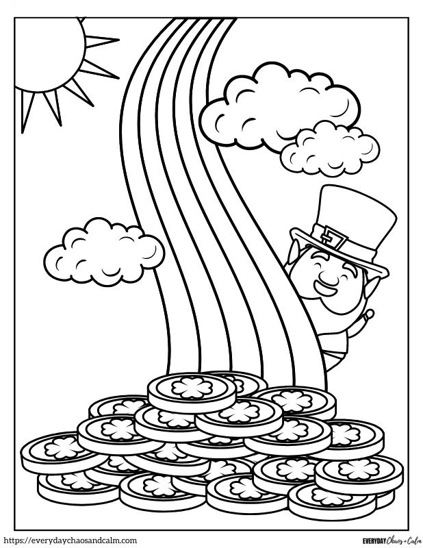
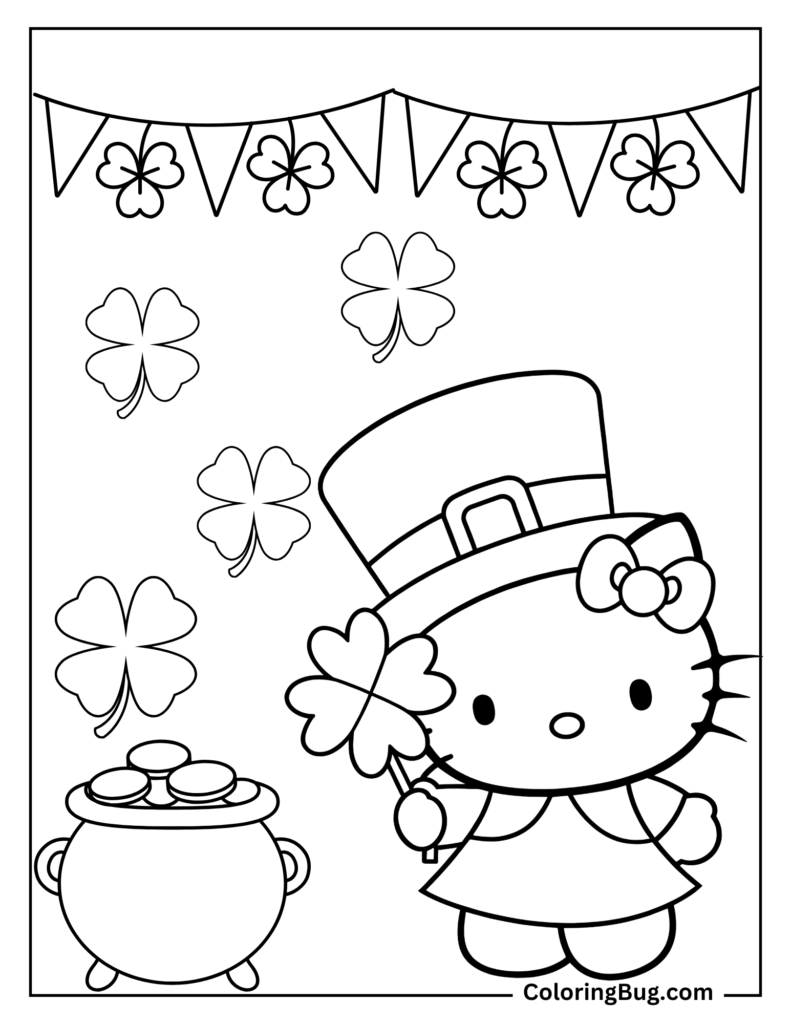
Conclusion and practical framework for printing st patrick_s day coloring page: Consider the amount of white space and space for creative choice. A page with breathing room invites color experimentation and personal flair, while cramped designs limit imagination. Does the theme match the purpose, whether entertainment, creativity, education, seasonal activity, or quiet time? Printable quality matters too: confirm the page is sized for typical printer paper, prints in black and white with clean edges, and leaves appropriate writing space when relevant. Finally, use a simple five questions framework before printing st patrick_s day coloring page: Is the page sized correctly? Are the outlines clear on a standard printer? Does it support the activity goal? Is there room to add personal touches? Are the margins usable and forgiving? Be mindful of common problems such as tiny spaces, overlapping lines, missing writing space, off-page elements, and overly dense patterns.