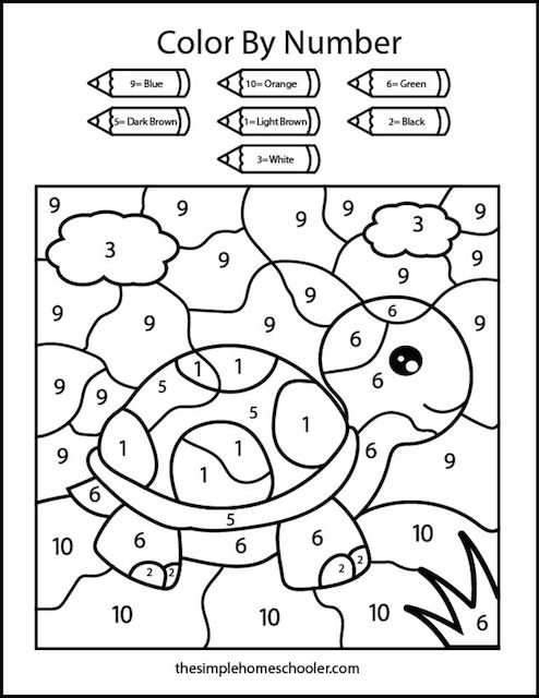
From my studio table I watch pigments come alive on a single page. The printable color by number pages I design invite the mind to wander as the brush follows numbered whispers, turning quiet lines into a blooming scene.
As a coloring book artist, I think of these pages as tiny worlds waiting beneath your fingertips. Each area is badge numbered to guide color choices, but the real magic is in the process: you breathe, you settle on hues, and you let the numbers become a map. You might start with a soft sky and gradually layer deeper tones, or you could experiment with a bold palette to bring texture into flowers and feathers. These pages are designed as portable studio sessions—lightweight, printable at home, and ready whenever you crave a mindful break. From sunlit seas to patterned mandalas, the subjects balance line work with room to breathe. The goal is not speed but presence, a quiet collaboration between your chosen colors and the gentle structure of the drawing.
Color by Number Essentials
To get the most from a printable color by number page, start with a light plan. I sketch a quick color map, choosing a palette that matches the image's mood. Then I begin with pale base tones and gradually introduce shadows, letting the numbers guide each fill without rushing. Keep the page flat, work in short sessions to preserve brightness, and use a light touch near edges to keep lines crisp. If you want subtle texture, layer with slightly darker tones after the base coats. This sequencing helps the artwork feel cohesive, whether you color a tranquil landscape or a playful creature.
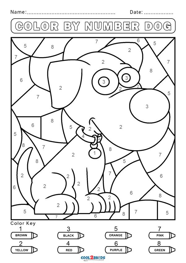
These printable pages travel well, turning a waiting moment into a small creative voyage. Teachers and caregivers often lean on color by number activities to build focus and color recognition without friction. For young artists, the numbers demystify color choices while inviting exploration of tone and harmony. For adults, they become a soothing ritual during commutes or quiet evenings. I design scenes with generous white space, allowing room for personal accents—perhaps a splash of turquoise in a wave or a warm amber in a sunlit corner. The simpler pages are great for beginners, while more intricate patterns reward patient layering.
Practical tips
Here are practical tips from my sketchbook to keep your coloring experience smooth. Pick a cohesive color family and limit yourself to 3-4 hues per page to preserve harmony. Before you start, test colors on a small swatch to see how they look on your chosen paper, then apply light base coats and build gradually. A sharp pencil or fine-tipped marker can help with tiny areas, while a soft brush lends smoothing near curved lines. Remember to rotate pages slightly as you color; this helps your wrist and reduces glare from lighting.
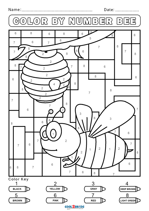
As a collector of such pages, I love how the imagery evolves across collections. A single printable color by number can offer landscapes, animals, or intricate tessellations that invite new color theories each time you color. When you finish, the image often feels both familiar and newly vibrant, a reminder that structure and creativity can share the same space. Because every page is printable at home, you can print a fresh version if a color idea sparks later and compare how different palettes change the mood.
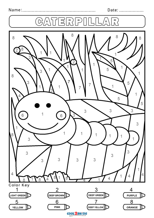
Ultimately, the joy of coloring comes from the dialogue between line and color, a simple conversation you can revisit again and again. Each printable color by number page offers a clean slate, a chance to slow down and listen to your own rhythm. As a coloring book artist, I design with that rhythm in mind, balancing clear borders with generous space for your personal touch. If you frame the finished piece, it becomes a reminder that structure can be a companion to spontaneity, and that poetry lives in the tiny decisions of shade and saturation. Share your favorites with friends, gift a page to a student, or create a small gallery wall at home.