
Two coloring pages about the same subject can feel very different in how usable and engaging they are. Subtle design choices, not the subject itself, shape pace, attention, and enjoyment for kids at home or in class. This guide helps you spot the design traits that make a page truly usable.
Evaluation begins with purpose and context. Before you hand a page to a child, ask what the page is meant to do: entertain, support a moment of quiet, or build a small sense of mastery. A well designed page aligns with the task, not just with a cute subject. Consider the setting: at home, in a classroom, or during a brief break between activities. A page that works well on a tablet may not translate to paper printing, and vice versa. Observing how the image is framed, how much space is asked for coloring, and whether there are helpful cues on the page can offer early clues about usability. Finally, look for consistency across a set: similar margins, line weight, and page orientation help a child switch from one option to another without reorienting their expectations. This guide is about practical checks that honor the realities of how kids color and how adults supervise, not about glossy claims of outcomes. The aim is to help you compare options and choose pages that feel intuitive and calm to use.
Two coloring pages on the same theme can produce very different experiences because designers prioritize different things. One page may emphasize bold shapes, simplifying lines so small hands can stay inside the borders. Another may pack many tiny details that demand steady pencil control or marker precision that newer drawers find frustrating. The first kind often supports quick engagement, while the second can reward practice and focus for older children. The critical question is not which subject is preferred, but which version will meet the child's current abilities and the setting's realities. A good comparison looks at edge clarity, border continuity, and the way shading hints are conveyed. If two pages cover the same dog day theme, you should still be able to predict how much attention and time each will require, and whether there is enough space for the child to complete a satisfying image. That predictive sense is the heart of a practical evaluation.
Child-First Approach
Start With the Child, Not the Picture. Age, ability, interests, and purpose should guide your selection before you even glance at illustration style. A younger child may benefit from pages with thick lines, large shapes, and clear color areas, because this reduces frustration and supports a sense of progress. An older child or a student practicing fine motor control may prefer pages with narrower borders and more intricate textures, offering a challenge that remains achievable. Interests matter too: if a child loves dogs who wear hats, or dogs at the park, a page that lets them personalize a scene can be more engaging than a generic outline. Consider the intended use: a quick calm-down activity, a family craft project, or a reading time extension. A well suited page suits the moment, not just the subject. If you frame the choice around the child's current tasks, you are more likely to select pages that are usable and enjoyable rather than visually impressive alone.
Detail Level
Check the Level of Detail. Large spaces are friendlier for younger children and beginners, because they allow color choices with broad strokes and fewer errors. Small spaces, dense linework, and many tiny elements can be discouraging for little hands and may turn coloring into a frustrated test rather than a creative activity. Consider line complexity too: crisp, readable outlines help children stay within the intended shapes, while jagged or inconsistent lines can lead to confusion about what to color first. Visual density matters as well; a page with too little detail can feel unfinished, while a page overloaded with texture can overwhelm. A balanced page often provides a clear main subject, a few secondary elements, and sufficient room around the edges for hands to move. If you can, test a page with markers, crayons, and pencils to see how the tools behave and whether the medium alters how much attention the design demands. A well designed detail level supports a steady, focused coloring session rather than a rushed or chaotic one.

Look at the Line Quality, Consider the Amount of White Space, and Is There Enough Room for Creative Choice? Clear outlines and readable shapes make it easier for kids to identify where to color and to stay within lines. The line weight should feel intentional and consistent across the page; inconsistent lines can cause misreads about edges, especially for children still learning to control a pencil or crayon. White space is not wasted space; it gives eyes a place to rest, prevents visual fatigue, and helps in planning color placement. A page with generous margins and a clear central image invites collaboration between the child and the tool they are using. Equally important is whether the design leaves room for creative choice. Pages that are too rigid may stifle self expression, while open layouts invite color experimentation, background details, and personalization. The best pages strike a balance: they guide and support while still inviting the child to make creative decisions.
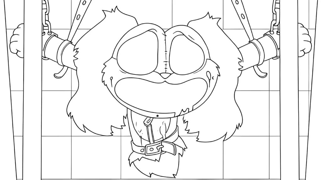
Does the Theme Match the Purpose? Thematic alignment matters for engagement and for the page's utility. A page intended for quiet coloring during a break should avoid confusing busy backgrounds; instead, look for calming compositions with clear focal points. For educational or creative aims, you may want pages that invite counting, pattern recognition, or storytelling prompts, but these come with the caveat that content remains age appropriate and not overbearing. Seasonal or event themed pages can be effective prompts for relevance, but ensure the motifs are easy for the child to recognize and enjoy. Printable quality matters too: a clean scan, crisp black lines, and consistent space around the image help when printing at home. The five questions to ask before printing dog day coloring pages can guide a quick check: Is the page oriented correctly on the page? Do the lines print cleanly with your printer settings? Is there enough space for writing if writing is relevant? Does the page fit the child's skill level and interests? Does the layout support the intended activity time?
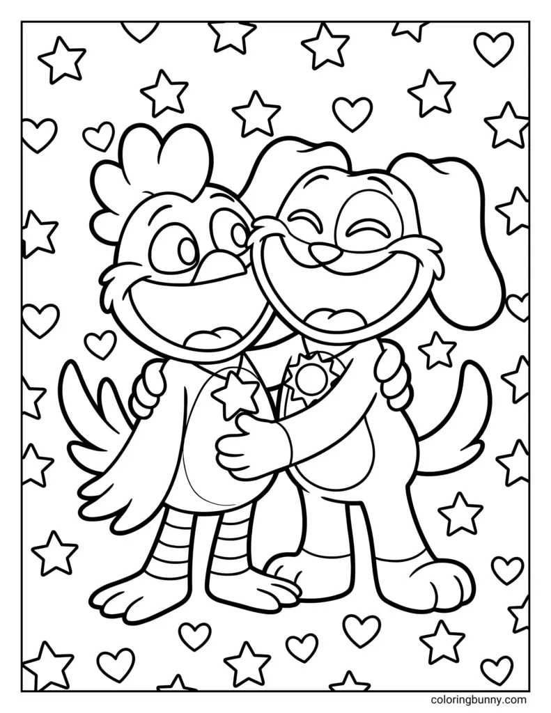
Common Coloring Page Design Problems and Conclusion. Problems include pages with inconsistent margins, too much or too little white space, tiny text or illegible linework, and pages that demand excessive precision from young artists. Another common issue is pages that feel static rather than interactive, offering little opportunity for personal expression or variation. When you encounter these, explain to caregivers that usability matters as much as subject, and you can choose alternatives that invite more control, pacing, and creativity. A good coloring page should be enjoyable, usable, age appropriate, and purposeful, without claiming to deliver specific outcomes. It should provide clear activity boundaries that suit the setting, and leave room for the child's voice to appear in color choices, shading, and composition. As you finalize selections for a class or family routine, use the earlier checks to build a small, repeatable process for choosing pages. The aim is not perfection, but pages that respect children’s different stages and encourage a calm, focused coloring experience.