
Two fire safety coloring pages can feel worlds apart, even when they cover the same topic. Page A may show a single fire extinguisher with bold blocks of color, while Page B places the extinguisher in a larger home scene with doors, signs, and several smaller details. The difference comes from how the designer balances clarity, challenge, and purpose. For parents and teachers, the starting point should be the child. Age and ability shape what counts as a successful page: for toddlers, bold, clear shapes with limited lines are more approachable; for older preschoolers, a few more elements can be included while keeping everything readable. When the page is intended for a group activity, consider how long a child is likely to stay engaged and whether the layout supports taking turns. Reflect on the learning goal behind the activity, not just the artwork: is this a quick warm-up, a guided discussion, or a quiet, independent task? Finally, test the page with the child or a co-learner. A success is a page the child can enjoy, understand, and complete without frustration. Those early decisions set the tone for a positive experience that feels purposeful rather than ornamental.
Start With the Child
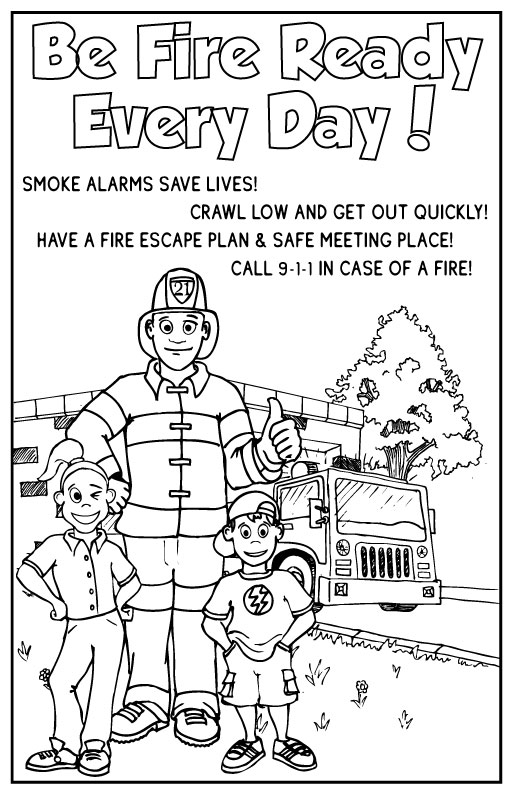
Two fire safety coloring pages can feel worlds apart, even when they cover the same topic. Page A may show a single fire extinguisher with bold blocks of color, while Page B places the extinguisher in a larger home scene with doors, signs, and several smaller details. The difference comes from how the designer balances clarity, challenge, and purpose. For parents and teachers, the starting point should be the child. Age and ability shape what counts as a successful page: for toddlers, bold, clear shapes with limited lines are more approachable; for older preschoolers, a few more elements can be included while keeping everything readable. When the page is intended for a group activity, consider how long a child is likely to stay engaged and whether the layout supports taking turns. Reflect on the learning goal behind the activity, not just the artwork: is this a quick warm-up, a guided discussion, or a quiet, independent task? Finally, test the page with the child or a co-learner. A success is a page the child can enjoy, understand, and complete without frustration. Those early decisions set the tone for a positive experience that feels purposeful rather than ornamental.
Check the Level of Detail
Detail level matters as much as the subject matter. A well-designed fire safety coloring page should provide a clear focal area with large colorable spaces and a few smaller areas that offer a touch of challenge without becoming frustrating. Look for large, open spaces for base colors like walls, floors, and safety devices, and assess how many interior items are realistically printable at typical home sizes. Small spaces can introduce opportunities for color shading or texture if they are big enough for a crayon; if not, they may frustrate younger colorists. Consider line complexity: simple, clean lines help kids stay within shapes and reduce confusion about what to color. Visual density also matters: a page with too many objects packed into a small area can feel overwhelming, while a page with too few elements may seem dull. If the page is intended for classroom work, balance the area so every child can contribute. Finally, ensure the design supports the intended age range and the time you expect for the activity, whether it is a quick 5-minute exercise or a longer, more involved project.
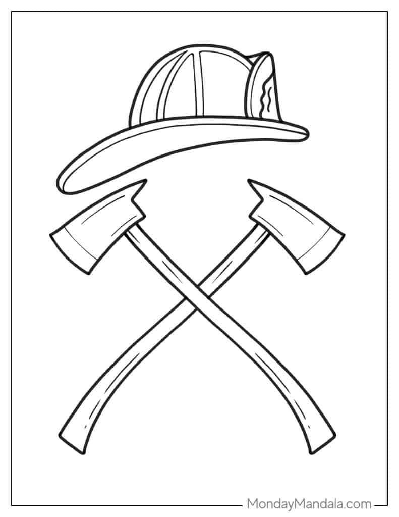
Look at the Line Quality. Line quality affects readability and printing. Clear outlines help children distinguish shapes and recognize firefighting elements like a smoke alarm or exit sign. Favor continuous, unbroken outlines rather than jagged lines that can confuse younger children and printing processes. Thick outer lines with slightly thinner inner lines create a readable hierarchy that guides the eye from the main shape to interior details. If a page relies on ultra-thin lines, it may blur when printed in grayscale or on a typical home printer. Test print a copy to see if the image remains legible and inviting. Also consider whether the lines will hold up to crayon, marker, or watercolor; overly delicate lines can tear or feather. The goal is to keep silhouettes simple enough for quick recognition while preserving enough detail to convey the safety theme.
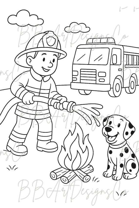
Is There Enough Room for Creative Choice? Does the Theme Match the Purpose? A page should invite kids to make color choices and arrangement decisions, not dictate every line. When a design uses rigid, identical parts, it can limit exploration and dampen engagement. Look for open areas where children can choose colors for walls, doors, or equipment and consider prompts that invite problem solving rather than simply filling spaces. At the same time, the theme should align with the activity's purpose. If the goal is to reinforce a safety concept in a classroom, the page should clearly feature the key elements—exit signs, alarms, safe routes—in a way that supports discussion. For general entertainment or seasonal activities, a lighter emphasis on instruction can be acceptable while still including recognizable safety cues. Striking the right balance between structure and flexibility creates pages that support both personal expression and purposeful practice.
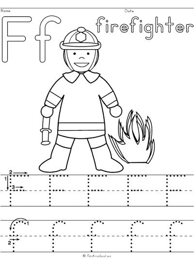
Printable quality matters when you print at home or in the classroom. Page size and margins should work with standard sizes like Letter or A4, and lines should remain crisp in black on white paper. Check that ink usage is reasonable so families can print multiple pages without excessive costs, and that line clarity holds at common home printer settings. Consider whether there is enough writing space for captions or teacher prompts if the page is used in a lesson. Five quick questions to ask before printing a fire safety coloring page: 1) Is the content age- and setting-appropriate? 2) Will it print cleanly on available equipment and paper? 3) Do the lines stay legible when printed in black and white? 4) Is there space for writing or discussion prompts? 5) Does the image leave a clear focal point and sensible margins? Common design problems include overcrowded layouts, elements that are too tiny to color, inconsistent line weight, and margins that truncate key details. A good page should be enjoyable, usable, age-appropriate, and purposeful. Conclusion.