
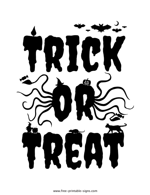
As a digital product creator, I design a practical printable trick or treat sign that combines friendly Halloween visuals with crisp typography, making it easy for households to signal candy zones, guide trick-or-treaters, and stay organized on busy porch fronts.
Understanding your audience is essential when crafting a printable trick or treat sign. Families want something that can be printed quickly, folded for porch display, and read from the street. Teachers and community organizers may reuse signs for Halloween events, so durable messaging matters more than flashy graphics. The best signs offer clear messaging, simple visuals, and a friendly tone that suits kids and neighbors alike.
Organization starts with a simple plan. Define the size and where it will appear, then assemble complementary assets such as a matching porch banner or a small reminder card for visitors. Preparation means testing a print on plain paper before any final print run, checking legibility at typical viewing distances, and ensuring color contrast works under common lighting. As a creator, I encourage keeping a clean template with scalable type and modular elements so users can adjust text without breaking alignment.
Printable trick or treat sign
From a usability perspective, readability wins. Use bold, high-contrast type and limit the number of messages on the sign. A straightforward message like Trick or Treat Ahead or Please Take One is more effective than crowded blocks of text. Keeping the layout simple also helps when people print in grayscale or on different printers.
Color and layout
Color choices should support visibility in dusk or evening, but still reproduce well in common home printers. Consider a palette with 2–3 bold colors and a neutral background so the text remains readable across devices. Include a dedicated space for the year or neighborhood name if the user wants a sense of place, and offer a few optional icons like candy, pumpkin, or ghost to add personality without clutter.
Practical templates save time. When a user opens a printable trick or treat sign, they want a clean layout with clear editable fields and obvious print margins. Recommend including a preview page so customers can verify alignment before printing multiple copies. Also, provide consistent naming and folder structure guidance to keep projects organized, especially if buyers create multiple variations.
Testing and accessibility matter. Ensure sufficient contrast for readers with visual differences, and consider a larger font option for curbside viewing. If your product includes editable text, show a short note about how to customize safely without distorting the design. A well-documented file or template helps non-designers feel confident making small changes.
In short, a printable trick or treat sign should balance charm with practicality. By focusing on audience needs, clean organization, and thoughtful preparation, creators can offer a reliable product that families reach for year after year. When you walk through the design and production steps with a user-centric mindset, the end result is not just attractive—it’s genuinely usable for a busy Halloween season.