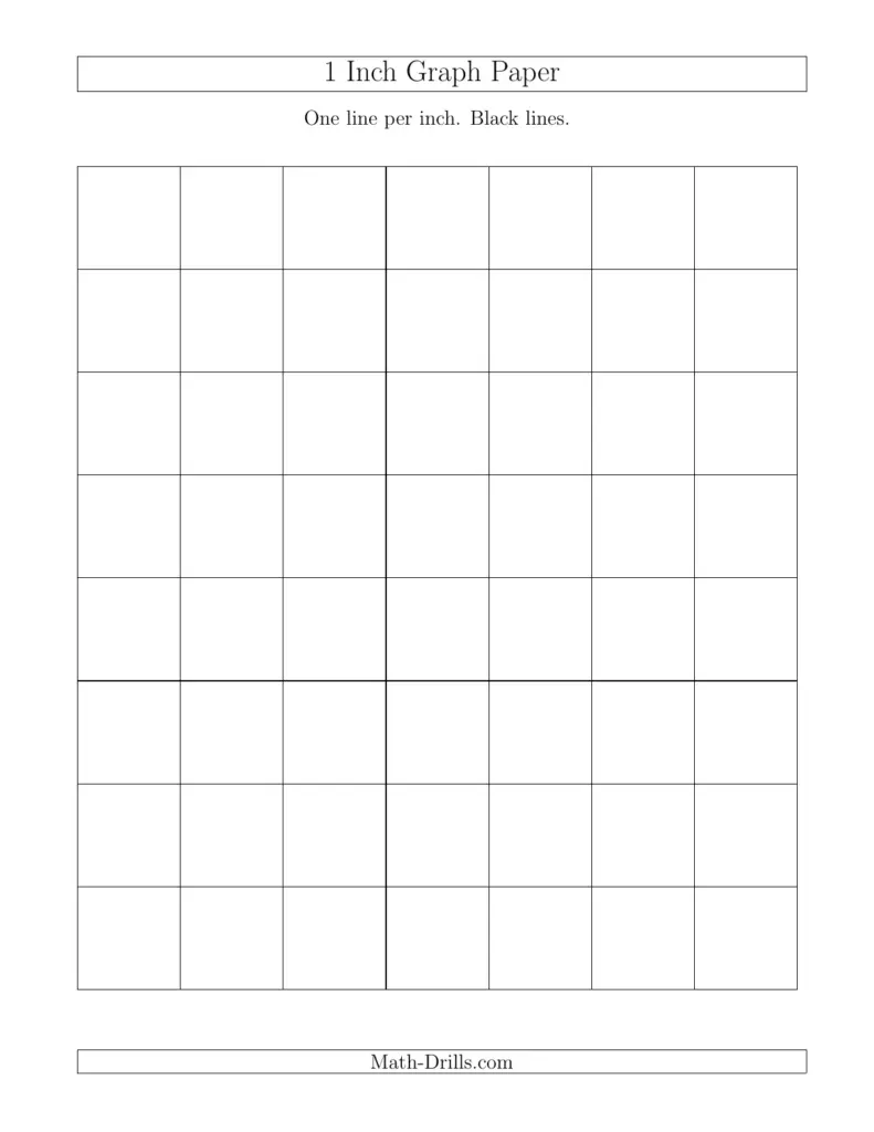
When you look for 1 inch grid paper printable, you are seeking a reliable tool to organize ideas, measure spacing, and test typography on a clear backdrop. The 1 inch grid provides consistent reference lines that help maintain rhythm and balance in any layout for sketching, planning, and precision tasks.
From a designer's perspective, the 1 inch grid is a quiet tool that keeps typography aligned, blocks consistent, and spacing legible. I start by choosing a focal point on the page and then align margins to the outer grid so nothing feels crowded. Hierarchy emerges by letting heavier typographic decisions sit near major grid lines, while lighter details tuck into the spaces between. The clarity of the grid makes revisions predictable, and that confidence translates into more readable results, whether you are sketching a poster, outlining a brochure, or mapping a dashboard. That clarity saves time and reduces revision loops, which matters when deadlines tighten.
Practical uses
In practice, I treat each inch as a decision point for rhythm and alignment. A 1 inch grid helps set column widths, gutter sizes, and baseline alignment for headlines. By deliberately placing elements on the grid, you guide the reader's eye through the page with predictable pauses. For print or digital mockups, this discipline creates a clean, cohesive feel and reduces visual noise. Keep your grid options visible on the page as you work so you can swap it without losing structure.
Beyond typography, 1 inch grid paper printable shines for planning calendars, teaching worksheets, or quick prototypes. Create a simple calendar template by drawing vertical and horizontal lines at standard increments, then mark weekends or holidays with a bolder emphasis. For hand lettering or logo concepts, the grid acts as a scaffold, helping you test proportions without committing to a final shape. The result is a versatile, tactile tool that supports iterative design without overwhelming you with options. Try different line thickness to explore weight without breaking the grid's rhythm.
Design tips
To maximize readability, keep contrast high and avoid crowding. Use a limited palette and let the grid anchor your typography scale; roughly, a 1 inch unit pairs well with a readable headline and body copy. When planning layouts, sketch multiple compositions on the same grid to compare balance, alignment, and whitespace. Remember that the grid is a guide, not a cage; let margins breathe and use empty space to emphasize the most important content. In both print and planning tasks, the disciplined approach of a 1 inch grid yields consistent, professional results. Always print a small scale proof to ensure the grid behaves in the real world.
As you work, consider how your audience will read the piece and how the grid supports legibility. The 1 inch increments help you pace lines, align captions, and maintain a comfortable line length. When you test color or imagery, let the grid keep everything anchored so even bold choices feel deliberate rather than incidental. In practice, I keep a simple set of rules: align the most critical elements to the grid, protect negative space, and review at actual printing size to confirm readability. If you need variety, redraw the same layout on an alternate grid size and compare.
In short, 1 inch grid paper printable is a simple tool with a surprisingly wide range of visual power. It supports clean composition, predictable hierarchy, and dependable readability across projects. By embracing the grid as a design partner rather than a constraint, you can iterate faster, communicate more clearly, and deliver layouts that feel balanced, crafted, and ready for presentation. The grid becomes a language you can apply across projects.