
As a designer who values clarity and craft, I approach a homeschool diploma printable as a finished piece of communication. It should honor achievement while remaining legible and visually balanced. Think typography, margins, and a restrained color palette that guides the eye to the graduate's name and date.
Layout and hierarchy
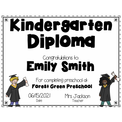
H2: Practical design decisions for a homeschool diploma printable. In shaping a diploma you are not just printing words; you are creating a keepsake that dignifies effort. Start with a clear typographic hierarchy: the student's name should be largest, followed by the program, the date, and the issuing authority. Use a restrained color palette with one accent color that appears on the seal or border. White space is a designer's ally: it helps the eye breathe and reduces clutter. Consider margins and bleed so the document remains legible when framed or scanned. When the content is balanced, the diploma reads as a confident statement rather than a cluttered page.
Paper and finish
Beyond the basics, the typography and layout choices tell the story of the graduate. Pair a sturdy serif for the name with a clean sans for the details to create a readable contrast. Keep font sizes within a tight range so the document feels cohesive rather than experimental. Align the main elements in a logical grid: name, program, date, signature lines, and seal should flow from top to bottom with consistent spacing. Subtle textures or a light watermark can add depth without defeating print clarity. If you offer a digital version, include a version with a high-contrast black text on white background to ensure legibility in low-light or aging printers. A well-crafted homeschool diploma printable balances form and function, turning accomplishment into a piece that families will proudly display.
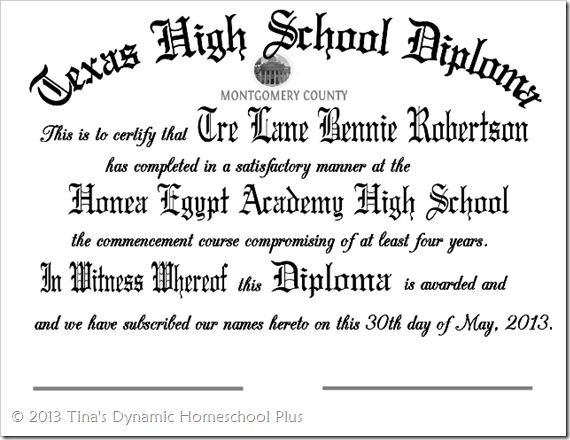
To customize effectively, start with a template that respects margins and a readable line length. Place the most important element—normally the graduate’s name—on its own line in a slightly larger size. Use additional lines for the program, date, and issuing authority, but keep embellishments modest. Decorative borders or a small seal should support the composition, not compete with the text. If you’re selling or sharing the homeschool diploma printable, provide a few color options and a grayscale version for black-and-white printers. Test print on the actual paper stock you plan to use and review it under the light conditions where it will be viewed. When in doubt, step back and measure the visual rhythm with a grid system; consistent baselines create a calm, professional impression even for simple designs.
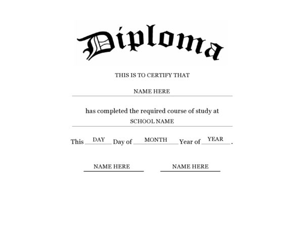
Consider the broader value of a homeschool diploma printable beyond the framed moment. It can live as a portfolio document, a memory page in a yearbook, or a certification copy for portfolio reviews and college applications. Include a printable version that fits on standard letter or A4 paper and a more compact version for scrapbooks. Add a simple line for a teacher's signature and a place for the date of issue to reinforce authenticity. If your business offers these as templates, provide editable fields or placeholders so buyers can personalize without redrawing the entire page. Remember to respect copyright and avoid using images or emblems you don't own. A thoughtful design invites both families and educators to engage with the diploma as a proud record of achievement rather than a mere form.
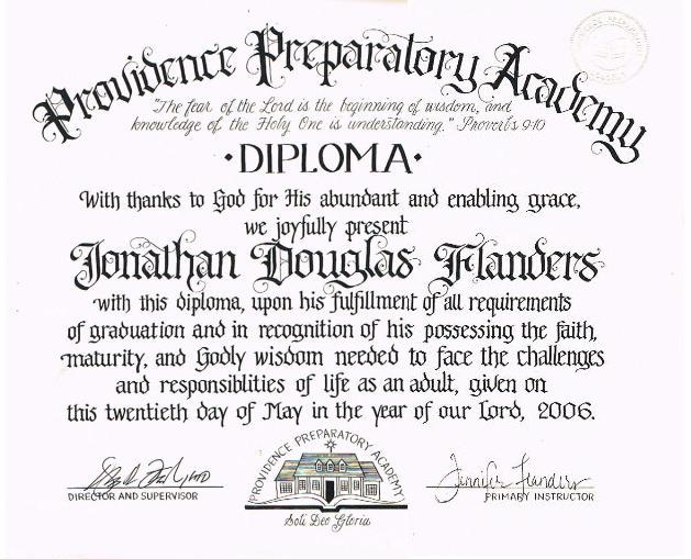
With a steady hand and a clear grid, your homeschool diploma printable becomes more than a document; it becomes a design artifact families will revisit. Start with a strong title, balanced margins, and a legible type pair. If you’d like, experiment with a few iterations and let the print test guide your final choices. Your finished piece will speak volumes.